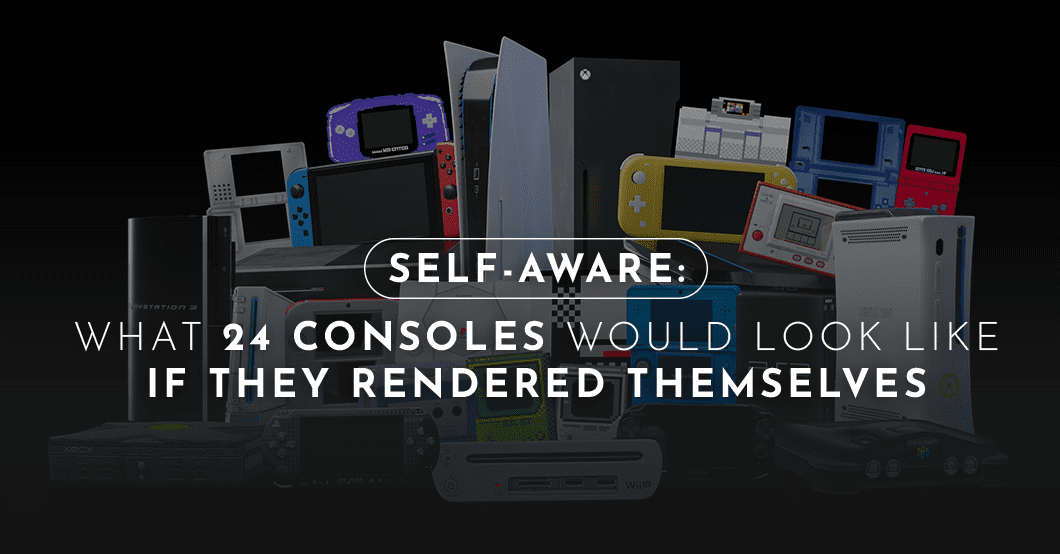
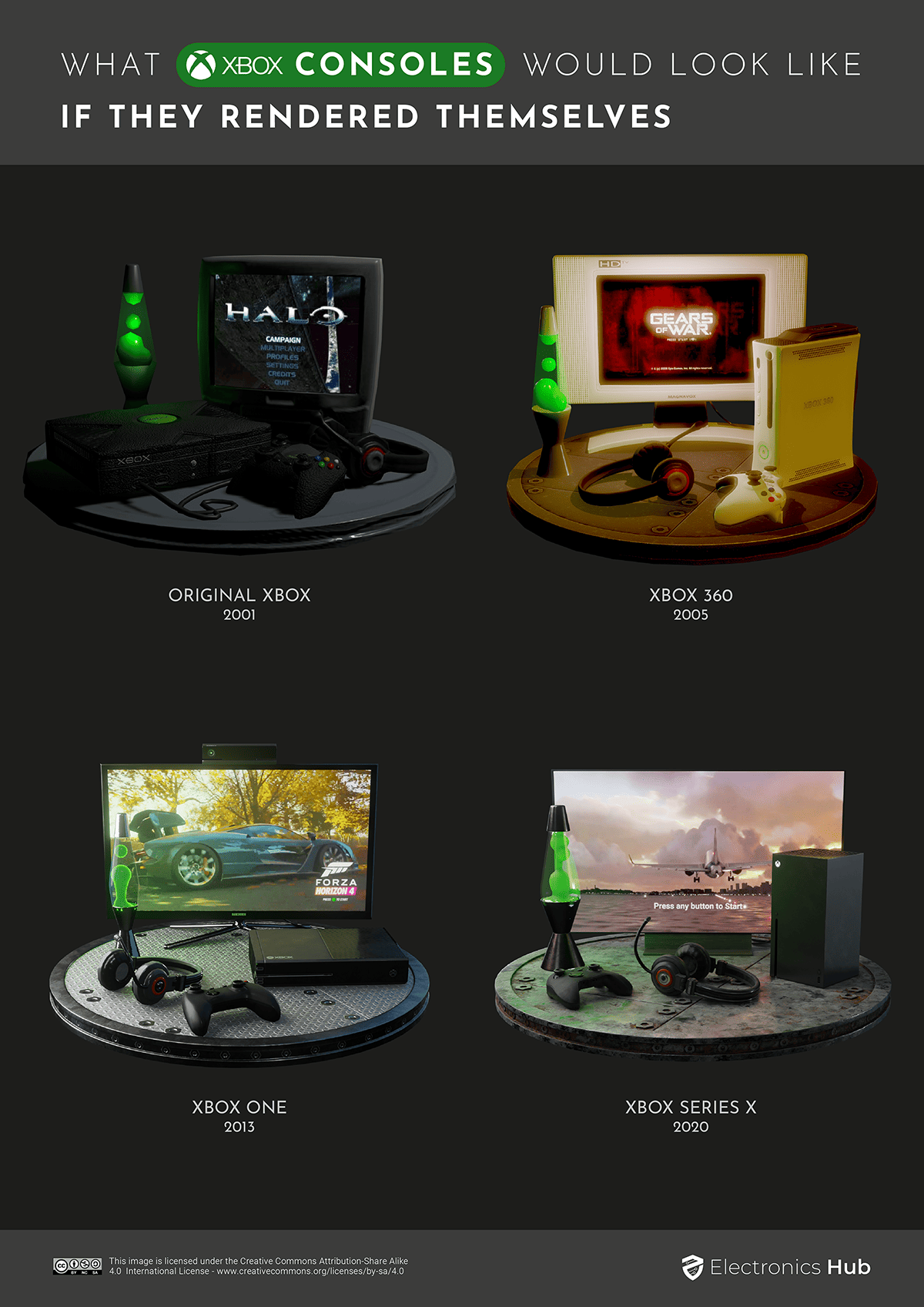
Pretty touchy, eh. Thankfully, the basilisk remains a mere thought experiment for now. But computers are already designing themselves and self-replicating robots. So it doesn’t hurt to wave the flag of allegiance in the direction of ‘self-improving AI,’ does it? {insert Boston Dynamics dog gif} Electronics Hub reckons the best way to offer a supportive gesture to killer AI of the future is to gently nudge our favorite games consoles in the right direction. We asked Elijah Robertson to redesign leading consoles of the past 40 years as if each had redesigned itself (inspired by Robertson’s 3D “Nintendo consoles as if they were rendered on themselves”). These are the top Nintendo, Sony, and Xbox devices rendered within the limits of their color palette, processing power, and hardware.
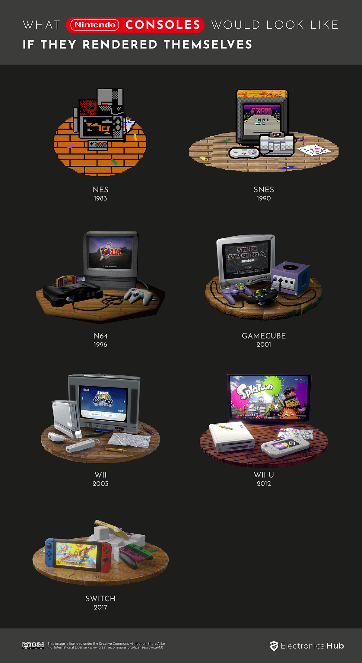
Nintendo Consoles Designed by Nintendo Consoles
Early Nintendo consoles are synonymous with 8-bit graphics, so it is adorable to see the NES rendered as it would have looked in an NES game. And then our Super NES/Famicon demonstrates what a huge leap it was from 8 to 16 bits. Nintendo themselves were caught off-guard by the success of Sega’s 16-bit Genesis (aka Mega Drive). The SNES had a palette of 32,768 colors (up to 256 on-screen), eclipsing Genesis’s 512 (64 on-screen). The SNES also got a ton more games and eventually outsold the Genesis. Things started to look more real with the 128-bit GameCube in 2001 (to be fair, the GameCube kind of looks like it was designed in 8-bit in the first place). But realistic Nintendo auto-design takes off with 2012’s Wii U, which introduced high-definition graphics to the series.
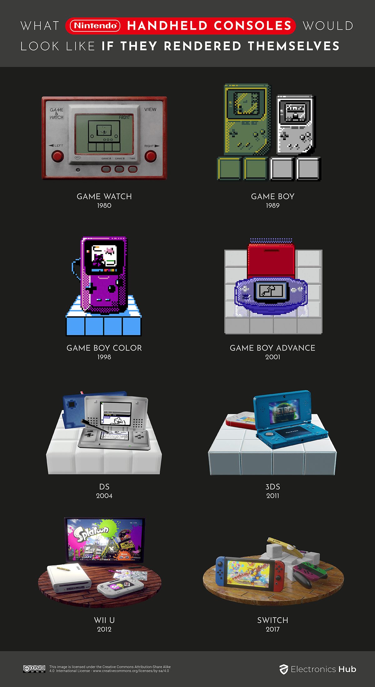
Nintendo Handhelds Designed by Nintendo Handhelds
Admit it: you came here for the Game Boy. The 1989 trendsetter is not Nintendo’s most-sold device ever, but fans regard it with the highest affection. While the 1998 Game Boy Color added 32,000 hues and a next-generation liquid screen to the arsenal, purists will respect what the original black and white version has done with its own self-render.
By contrast, the DS may have outsold the Game Boy, but the limits of its 3D capabilities echo the uninspired shell design of the device itself. The DS was great to play on, and the graphics looked fab at the time, but we’d need to wait for the Switch, complete with NVIDIA Custom Tegra processor, for another handheld design classic.
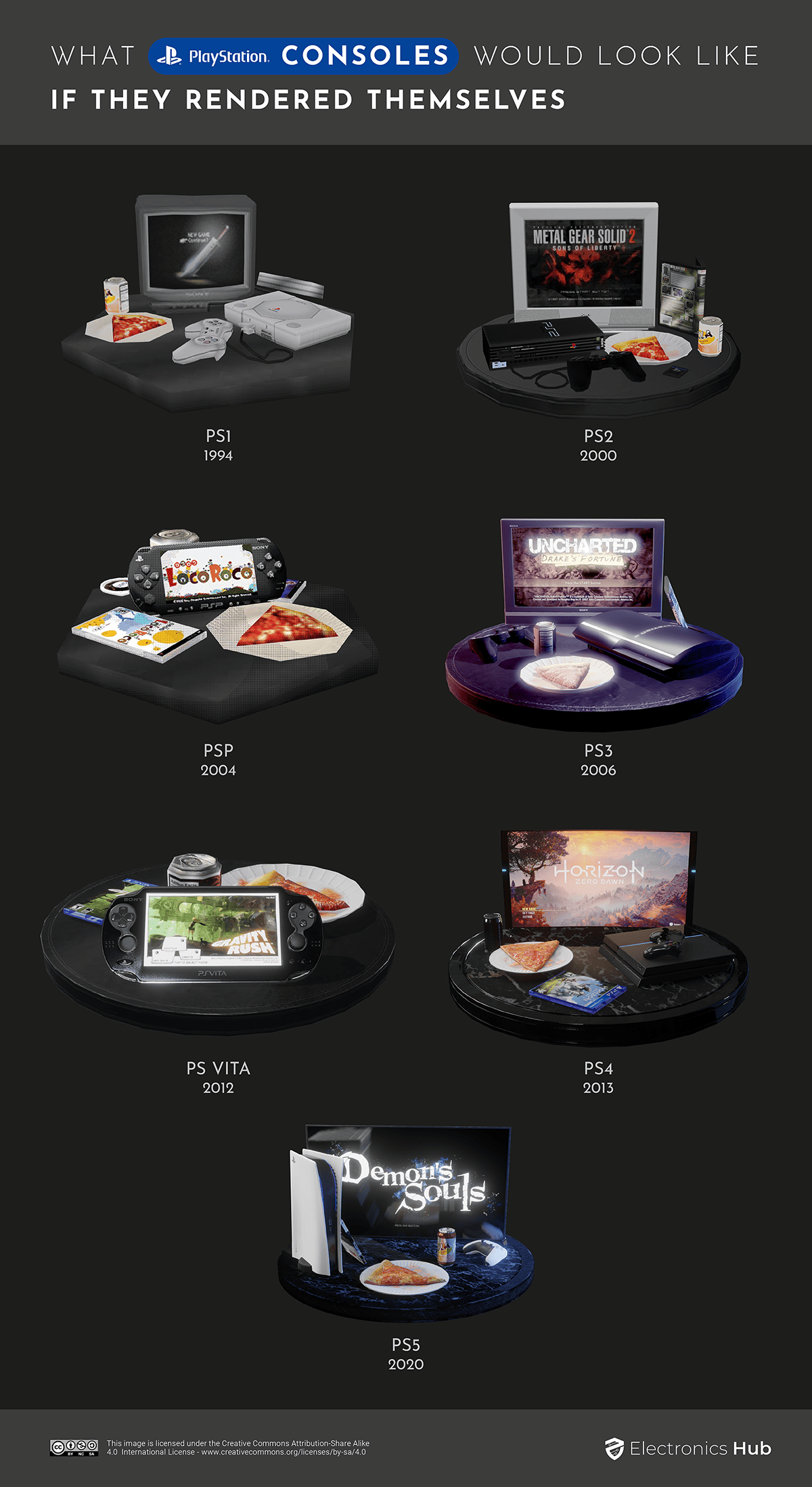
Sony Consoles Designed by Sony Consoles
Who ordered a pizza that refreshes at 120Hz? The PlayStation has come a long way since beginning life as a spin-off of the SNES. The original 32-bit machine even looked like a Nintendo, a hangover Sony soon remedied with the sci-fi monolith design of the PS2 – bringing the brand in-line with Sony’s aesthetic of the sci-fi magic box. “The most difficult challenge to overcome was to give [the PS2] a design that would be popular all over the world,” said designer Teiyu Goto. He made it universal by setting the ‘blue’ of planet Earth in a blackness representing outer space. Cut to the rarely-seen PS5, and the PlayStation has undergone a major overhaul. On the inside: a variable refresh rate to maintain 4K graphics at 60 or even 120 frames per second even when the action is hottest. And on the outside: a switch to a white chassis that looks like a Zaha Hadid space sandwich. “When you design something, you want to make it feel comfortable,” explains PS5 designer Yujin Morisawa. “Sometimes it looks like a plant or some animal or some object. I think that’s more comfortable than something that’s weird, or something that they’ve never seen before.”
Xboxes Designed by Xboxes
Microsoft’s gaming unit doesn’t have embarrassing baby photos, having emerged during the sixth generation of consoles. By this point, brands stopped referring to the bit count of their machines and instead compared unwieldy memory and processing figures between devices. Needing to make an impact, Microsoft hired the design firm behind the original Polaroid camera and the interiors of Boeing planes. Those geniuses devised a box with a massive X on it. Xbox designers would continue to lean into Microsoft’s patented ‘it’s a box that does things’ aesthetic throughout successive generations. The 360 was the most radical departure, with its white body and slim waistline (even slimmer for the black 360 S). Gamers could even customize their 360 with a decorative faceplate. But nobody did. “The idea wasn’t bad,” claims Microsoft’s Albert Penello. “People used to put faceplates on their cell phones… [But it] turned out nobody bought it. We killed that one pretty quickly.”
Dangerous Beauty
The idea of machines replicating themselves is dangerously beautiful. And yeah, kind of cool. But a computing machine is not a neutral actor: any console that rebuilds itself is doomed to carry the inherent bias of its progenitor. The design principles of the sentient gray box on your desk are one thing. But what about the corporations – Google, Apple, Huawei – with the potential to create autonomous, recursive self-improvement machines? Just imagine if Mark Zuckerberg created a system that could design its own hardware. What – or who – might that look like? Comment * Name * Email * Website
Δ




![]()